
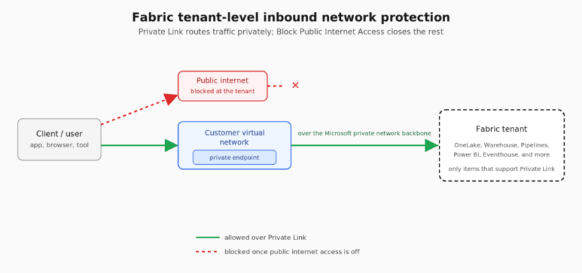
Fabric’s inbound network protection gives you two tenant-level controls: Private Link, which routes traffic through your virtual network instead of the public internet, and Block Public Internet Access, which closes the public internet off entirely once Private Link is in place. Together they look like the obvious move if you’re trying to get a data platform off the public internet. Flip two settings, close off the internet, ship a more secure platform. That’s the pitch.
As of July 2026, it isn’t that simple. Enabling them changes how a specific, and fairly long, list of Fabric features behaves. Some keep working but in a degraded state; others stop working entirely. None of it is undocumented. It’s just spread across a dozen different Microsoft Learn pages, and almost nobody reads all of them before changing a tenant setting. Here’s what stands out on that list.
The ones that redesign your architecture
I’d flag on-premises data gateways first. Turn on Private Link, and you can no longer register a new gateway or migrate, restore, or take over an existing one. Every Fabric item that leans on an on-premises gateway is exposed to that: Dataflow Gen2, pipelines, semantic model data sources, mirroring. A virtual network data gateway is the only supported replacement, and if your organization has gateway infrastructure built around the on-premises gateway, moving it to a VNet data gateway is its own migration project.
Mirroring has an extra problem on top of that. A virtual network data gateway looks like it should fix this one, and it doesn’t. If you’re mirroring a SQL Server 2016 through 2022 database into Fabric, whether it’s on-premises, on an Azure VM, or on another cloud, that mirroring uses Change Data Capture under the hood, not the change feed mechanism SQL Server 2025 uses. Microsoft’s Private Link exception list for mirroring is short: open mirroring, Azure Cosmos DB, Azure SQL Managed Instance, SAP, SharePoint List, and SQL Server 2025 mirroring specifically. CDC-based mirroring for 2016–2022 isn’t on it. Turn on Block Public Internet Access, and active mirrors for those databases pause while new ones can’t be started.
That gateway solves connectivity to the source, which is a different problem from the one Block Public Internet Access creates. The restriction isn’t about whether Fabric can reach your database. It’s about which mirroring mechanism Microsoft has explicitly cleared for Private Link, and CDC-based mirroring isn’t one of them.
The realistic options are migrating the affected databases to SQL Server 2025, where native mirroring is on the supported list; switching to open mirroring, which means writing and maintaining your own publisher that pushes data into the OneLake landing zone; or dropping mirroring for those databases entirely and building the ingestion yourself with a pipeline or a notebook pulling from the source on a schedule. None of these is a small decision, and none is one you want to be making after the setting is already flipped and mirrors have already paused.
There’s more that forces a rethink. If any part of your build leans on a Fabric Data Warehouse, know that a pipeline’s Copy Data activity can’t move data into or out of it at all under Private Link.
Eventhouse loses even more ground: it can’t ingest from OneLake, can’t be the target of a shortcut, can’t be connected to a pipeline, and loses both queued ingestion and T-SQL support. If real-time analytics is part of the plan, Private Link takes most of Eventhouse’s usefulness with it, which usually means designing around it from the start rather than bolting it on later.
Purview is affected too. Data Map scanning of Fabric is unsupported over Private Link, so if Purview is how you catalog and govern this data, that scanning simply stops. The OneLake Catalog’s Govern tab, Fabric’s own governance surface, stops working as well. Separately, Purview Information Protection also breaks in Power BI Desktop: sensitivity labels stop resolving, the Sensitivity button grays out, and pbix decryption fails. That last one only matters if the label is tied to a Purview publishing policy that encrypts the file. When that’s the case, Desktop has to call out to the rights management service to decrypt the file before it’ll open at all, and without that call, it just won’t open. Sensitivity labeling in Desktop depends on Exchange Online Protection and Azure Information Protection behind the scenes, so opening service tags for those two services restores label resolution and pbix decryption there. It’s a client-side network exception, though, not Fabric itself gaining Private Link support for Purview Information Protection. If you’re actually relying on Purview to govern this data, neither of these is a detail to find out about after go-live.
If you were planning on using cross-tenant OneLake shortcuts to collaborate with vendors, partners, or customers, those are not supported over Private Link.
The capabilities you lose
Below that tier, but still enough to change what you can build, is a set of items where the setting doesn’t just reroute traffic, it removes product functionality outright.
The first Spark job or Lakehouse table operation you run provisions a managed VNet for the workspace it runs in, which disables the prewarmed starter pools Fabric normally uses to get notebooks running fast. That managed VNet allocation is permanent, so once it happens, you lose the ability to migrate the workspace to a capacity in a different region.
Email subscriptions for Power BI reports fail across every subscription type. The paginated report side of that is the one to take seriously. People often choose paginated reports over interactive ones for exactly this reason. They’re built for pixel-perfect print and PDF output. They also export to Excel, Word, and CSV. And they can be emailed on a schedule to people who never log into Power BI at all. If that’s the requirement you’re building for, losing subscriptions doesn’t degrade the report. It removes the reason it exists.
Data agents can’t use Kusto/Eventhouse, semantic models, or mirrored databases as sources under Private Link. Only lakehouse, warehouse, and Fabric SQL Database sources still work.
Copilot in Power BI is unsupported in a Private Link environment. That covers the chat pane for Q&A over a semantic model, report and visual creation from a prompt, DAX query generation and explanation, measure descriptions, and narrative summaries in reports and email subscriptions.
The annoyances
Then there’s the stuff that hits lesser-used features. Each one still stops working completely, not just gets worse, but none of it is going to stop a project on its own.
Exporting a Power BI report to PDF or PowerPoint stops working. Power BI usage metrics start returning partial data, or none at all. Power BI’s Publish to Web stops working too, though plenty of organizations already have that disabled at the tenant level for unrelated reasons. Externally hosted images referenced in a Power BI report fail to load for the same reason: resolving them means an outbound fetch, and that’s exactly what Block Public Internet Access blocks.
If a semantic model or Dataflow Gen1 is built to pull from another semantic model or dataflow as its source (a composite model layered on an existing imported semantic model, for example), that connection breaks, because it relies on a network path that Block Public Internet Access blocks.
Individually, none of these is a reason to abandon the plan, though a couple of them, like the composite model case above, mean planning around them if that’s part of your design.
A couple of things are worth planning around before you start building. Trial capacities don’t work over Private Link at all. And a freshly created F-SKU capacity won’t support Private Link until its endpoint propagates into the private DNS zone, which can take up to 24 hours, so a capacity you just spun up can look broken when it’s really just waiting on DNS to catch up.
Why the gap exists
Based on how Private Link and Block Public Internet Access are documented to work, public endpoints appear to be Fabric’s baseline path for a lot of its traffic, since anything that doesn’t support Private Link either falls back to the public internet or gets blocked outright. Private Link and Block Public Internet Access change that at the tenant level, but not every service was built to work within that constraint. The list above is what happens when a tenant-wide security setting gets layered onto services that predate it.
What to do instead
If the list above outweighs what Private Link and Block Public Internet Access actually buy you in security, there are alternatives worth knowing about, none of them a perfect substitute, all of them worth understanding before you commit to one.
Lean on Conditional Access instead of network blocking. Every Fabric request already authenticates through Microsoft Entra ID. A policy requiring MFA, a compliant device, and sign-in only from named locations controls who gets in and from where, without touching Fabric’s network configuration. None of the breakage described earlier in this post happens with this approach. The tradeoff: traffic still crosses the public internet, encrypted but not privately routed. If your actual requirement is that data never touches the public internet, this doesn’t satisfy it. If the requirement is about controlling access, it usually does.
Protect the data, not just the path. Sensitivity labels tied to a Purview publishing or protection policy can encrypt content in a way that’s bound to identity, so where that’s set up, only authorized users can open the file, even if it crosses the public internet. That’s not automatic for every label. It depends on the policy attached to it. Pair that with Purview DLP policies scoped to Power BI and Fabric: they can flag a sensitive item with a policy tip, alert admins, or restrict access to it entirely, evaluated against the item’s data and labels, not the network path it travels.
One thing worth clarifying: workspace-level protection isn’t a lighter-weight version of the tenant-level decision. It has its own use cases, but it trades one set of limitations for another, plus adds more networking infrastructure to build and maintain.
Go in with eyes open
None of this is an argument against securing the tenant. It’s an argument for being specific about what you’re actually protecting against: unauthorized access, data exfiltration, or a hard requirement that data never leave a private network. Those are three different problems with three different tools, and Private Link plus Block Public Internet Access is only the right answer to one of them. Read the exception lists before you flip the switch, not after a mirror pauses in the middle of a project.
As always, the limitations will change as Fabric receives updates. Be sure to check the documentation for the latest information.
The post Think Twice Before Enabling Fabric’s Inbound Network Protection first appeared on Data Savvy.


