Lots of people have created Power BI reports, using interactive data visualizations to explore and communicate data. When Power BI was first created, it was used in situations that weren’t ideal because that was all we had as far as cloud-based tools in the Microsoft data stack. Now, in addition to interactive reports, we have paginated reports and notebooks. In this post, I’ll discuss when notebooks might be an appropriate visualization tool.
High-level comparison
If you haven’t looked into Fabric notebooks for data visualization, the table below offers a high-level comparison to Power BI reports. There are edge cases where you could do something successfully in either tool, but generally certain personas and use cases lean towards one or the other.
Feature
Power BI
Fabric Notebooks
Purpose
Designed for interactive dashboards and reports
Used for data exploration, transformation, and advanced analytics
Visuals
Drag-and-drop visuals, prebuilt charts
Code-based visuals using Python (Matplotlib, Seaborn) or Spark libraries
Interactivity
Highly interactive, slicers, drill-throughs
Limited interactivity; static charts unless using specific libraries
Best For
Business reporting and storytelling
Data exploration, debugging, machine learning/AI
Where do notebooks shine?
Notebooks are not usually the best interface for business dashboards and scorecards, but there are other situations where they might be better than a Power BI report:
Data dumps (can save to OneLake or blob storage when output contains a lot of rows)
Detailed static chart images
Maps (interactive or static)
Highly customized charts and uncommon chart types
High-density visuals
Adding advanced statistics, AI, or ML on top of a base dataset before visualization
You can create a table (or tables) of data and output them to an easily accessible location, whether that is downloading the data directly from a notebook or exporting to OneLake. You don’t need to create a visual first, just to export the DataFrame contents.
There are lots of great mapping libraries available for Python, so if you can’t achieve what you need in an Azure Map visual and don’t want to pay for ArcGIS or another embedded service, you may consider creating your map in a notebook. Check out Plotly and DataShader for examples.
A map created using Altair in a Fabric notebook created by Kerry Kolosko
Many Power BI visuals have a default of 3,500 data points allowed. Some visuals, such as the Azure Map, allow up to 30,000 data points by default. If you have a situation where the data should not be aggregated or sampled, a python visual may be a good option.
A scatterplot created using Matplotlib in a Fabric notebook created by Kerry Kolosko
Sometimes we want to create highly customized visualizations that are just not achievable in the core or free custom Power BI visuals. While you can usually make what you need in Deneb, it may require a lot of effort or you may be introducing a skillset that your team doesn’t have or has chosen not to emphasize. If your team already knows Python, you can explore creating visuals in a notebook and outputting them as SVGs to include in documents, presentations, or websites.
A swarmplot created using Seaborn in a Fabric notebook created by Kerry Kolosko
And while it’s possible to add AI or ML to your data using Power Query, it is often easier to use Python libraries to add these capabilities and then visualize the data immediately after.
Interactivity
Python visuals can offer some interactivity, depending on the library. It is often only within one visual. For instance, you might have a drop-down for selecting a category which filters a bar chart. Or you might use a lasso tool to select an area of a map. What is less common is to create a set of multiple charts in a single output that all interact with each other. That is one area where Power BI shines and requires little to no effort, since the default is for visuals to interact with all other visuals on the report page.
Remember your audience
While the visualizations produced by a notebook may be great for your audience, the notebook interface itself might not be ideal for consumption. Data engineers are often used to notebooks in other contexts, but the average business analyst might not want to use a notebook. This may lead to creating the visualization in one tool and consuming it in another. You’ll have to examine the context to and use case to decide if that is appropriate.
Could a notebook really be easier than a drag-and-drop interface?
If writing Python code seems unattainable, a notebook might not be for you. But I’d like to share a couple of thoughts about what has made Python easier for me.
The libraries
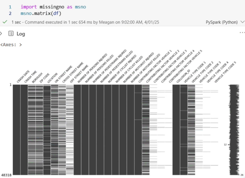
After learning about the concept of a nullity matrix, I set out to create one in Power BI for a Workout Wednesday challenge. After experimenting with core visuals and not liking the results, I switched to Deneb. I struggled a bit to get what I needed in Deneb and after an hour or so, I sought out help. The Deneb visual ultimately worked fine, but it was a lot of effort to get there. There is a free library to do this in Python. Once you have a DataFrame with the data you want to include, it’s two lines of code to create the visual.
A nullity matrix created using the missingno library created by Meagan Longoria
AI Coding Assistants
With AI assistants to help us write Python code, the barrier to getting our desired visual output in a notebook is possibly lower than ever. You can integrate AI assistants like GitHub Copilot or Claude Code into VS Code to have a more seamless development experience outside of a browser, if you prefer. Just be sure that your use of AI coding assistants meets any organizational and/or personal requirements around information security and intellectual property.
More posts on data viz in notebooks
I’ve planned at least a couple more posts to help people get started using notebooks for data visualization. Stay tuned!
The post Data Viz in Fabric Notebooks first appeared on Data Savvy.
https://procuresql.com/wp-content/uploads/2025/11/pythonnullitymatrix.avif7461024Meagan Longoria/wp-content/uploads/2024/05/Data-Architecture-as-a-Service-with-ProcureSQL.pngMeagan Longoria2025-11-24 01:30:312026-02-12 19:27:02Data Viz in Fabric Notebooks
To provide the best experiences, we use technologies like cookies to store and/or access device information. Consenting to these technologies will allow us to process data such as browsing behavior or unique IDs on this site. Not consenting or withdrawing consent, may adversely affect certain features and functions.
Functional
Always active
The technical storage or access is strictly necessary for the legitimate purpose of enabling the use of a specific service explicitly requested by the subscriber or user, or for the sole purpose of carrying out the transmission of a communication over an electronic communications network.
Preferences
The technical storage or access is necessary for the legitimate purpose of storing preferences that are not requested by the subscriber or user.
Statistics
The technical storage or access that is used exclusively for statistical purposes.The technical storage or access that is used exclusively for anonymous statistical purposes. Without a subpoena, voluntary compliance on the part of your Internet Service Provider, or additional records from a third party, information stored or retrieved for this purpose alone cannot usually be used to identify you.
Marketing
The technical storage or access is required to create user profiles to send advertising, or to track the user on a website or across several websites for similar marketing purposes.