Lots of people have created Power BI reports, using interactive data visualizations to explore and communicate data. When Power BI was first created, it was used in situations that weren’t ideal because that was all we had as far as cloud-based tools in the Microsoft data stack. Now, in addition to interactive reports, we have paginated reports and notebooks. In this post, I’ll discuss when notebooks might be an appropriate visualization tool.
High-level comparison
If you haven’t looked into Fabric notebooks for data visualization, the table below offers a high-level comparison to Power BI reports. There are edge cases where you could do something successfully in either tool, but generally certain personas and use cases lean towards one or the other.
Feature
Power BI
Fabric Notebooks
Purpose
Designed for interactive dashboards and reports
Used for data exploration, transformation, and advanced analytics
Visuals
Drag-and-drop visuals, prebuilt charts
Code-based visuals using Python (Matplotlib, Seaborn) or Spark libraries
Interactivity
Highly interactive, slicers, drill-throughs
Limited interactivity; static charts unless using specific libraries
Best For
Business reporting and storytelling
Data exploration, debugging, machine learning/AI
Where do notebooks shine?
Notebooks are not usually the best interface for business dashboards and scorecards, but there are other situations where they might be better than a Power BI report:
Data dumps (can save to OneLake or blob storage when output contains a lot of rows)
Detailed static chart images
Maps (interactive or static)
Highly customized charts and uncommon chart types
High-density visuals
Adding advanced statistics, AI, or ML on top of a base dataset before visualization
You can create a table (or tables) of data and output them to an easily accessible location, whether that is downloading the data directly from a notebook or exporting to OneLake. You don’t need to create a visual first, just to export the DataFrame contents.
There are lots of great mapping libraries available for Python, so if you can’t achieve what you need in an Azure Map visual and don’t want to pay for ArcGIS or another embedded service, you may consider creating your map in a notebook. Check out Plotly and DataShader for examples.
A map created using Altair in a Fabric notebook created by Kerry Kolosko
Many Power BI visuals have a default of 3,500 data points allowed. Some visuals, such as the Azure Map, allow up to 30,000 data points by default. If you have a situation where the data should not be aggregated or sampled, a python visual may be a good option.
A scatterplot created using Matplotlib in a Fabric notebook created by Kerry Kolosko
Sometimes we want to create highly customized visualizations that are just not achievable in the core or free custom Power BI visuals. While you can usually make what you need in Deneb, it may require a lot of effort or you may be introducing a skillset that your team doesn’t have or has chosen not to emphasize. If your team already knows Python, you can explore creating visuals in a notebook and outputting them as SVGs to include in documents, presentations, or websites.
A swarmplot created using Seaborn in a Fabric notebook created by Kerry Kolosko
And while it’s possible to add AI or ML to your data using Power Query, it is often easier to use Python libraries to add these capabilities and then visualize the data immediately after.
Interactivity
Python visuals can offer some interactivity, depending on the library. It is often only within one visual. For instance, you might have a drop-down for selecting a category which filters a bar chart. Or you might use a lasso tool to select an area of a map. What is less common is to create a set of multiple charts in a single output that all interact with each other. That is one area where Power BI shines and requires little to no effort, since the default is for visuals to interact with all other visuals on the report page.
Remember your audience
While the visualizations produced by a notebook may be great for your audience, the notebook interface itself might not be ideal for consumption. Data engineers are often used to notebooks in other contexts, but the average business analyst might not want to use a notebook. This may lead to creating the visualization in one tool and consuming it in another. You’ll have to examine the context to and use case to decide if that is appropriate.
Could a notebook really be easier than a drag-and-drop interface?
If writing Python code seems unattainable, a notebook might not be for you. But I’d like to share a couple of thoughts about what has made Python easier for me.
The libraries
After learning about the concept of a nullity matrix, I set out to create one in Power BI for a Workout Wednesday challenge. After experimenting with core visuals and not liking the results, I switched to Deneb. I struggled a bit to get what I needed in Deneb and after an hour or so, I sought out help. The Deneb visual ultimately worked fine, but it was a lot of effort to get there. There is a free library to do this in Python. Once you have a DataFrame with the data you want to include, it’s two lines of code to create the visual.
A nullity matrix created using the missingno library created by Meagan Longoria
AI Coding Assistants
With AI assistants to help us write Python code, the barrier to getting our desired visual output in a notebook is possibly lower than ever. You can integrate AI assistants like GitHub Copilot or Claude Code into VS Code to have a more seamless development experience outside of a browser, if you prefer. Just be sure that your use of AI coding assistants meets any organizational and/or personal requirements around information security and intellectual property.
More posts on data viz in notebooks
I’ve planned at least a couple more posts to help people get started using notebooks for data visualization. Stay tuned!
The post Data Viz in Fabric Notebooks first appeared on Data Savvy.
https://procuresql.com/wp-content/uploads/2025/11/pythonnullitymatrix.avif7461024Meagan Longoria/wp-content/uploads/2024/05/Data-Architecture-as-a-Service-with-ProcureSQL.pngMeagan Longoria2025-11-24 01:30:312026-02-12 19:27:02Data Viz in Fabric Notebooks
Have you ever added a visual to a Power BI report page and published the updated report only to realize you forgot to adjust a related bookmark? It’s very easy to do. The Power BI user interface doesn’t allow you to determine which visuals are included in a bookmark that includes only selected visuals. And it takes at least 4 clicks to open the Bookmarks and Selection tabs, and then select a bookmark to see which visuals are visible or hidden when the bookmark is selected.
If you’d rather not have to click around and guess, you can parse the JSON definition of your report, or use a Fabric notebook to get information about the bookmarks in a PBIR-format report that is published in the Power BI service. What I’ll demonstrate below is a great check to perform before publishing to a higher environment (e.g., test, stage, QA, prod, whatever you call your non-dev environments).
Code walkthrough
If you aren’t using an environment with Semantic Link Labs already installed, you must do that first as shown below.
%pip install semantic-link-labs
Here I import and alias the report module from Semantic Link Labs as well as pandas.
# Imports
import sempy_labs as labs
from sempy_labs import report

import pandas as pd
Next I need to create a report wrapper for the report in which I want to review the bookmarks.
The main function used here is the Semantic Link Labs list_bookmarks function, which returns a list of all bookmarks in the selected report.
The list_bookmarks function returns a DataFrame with the following columns.
What we see in the results above is a report with 3 bookmarks. The Sales Only bookmark includes all 7 visuals on the Dashboard page. Two of the 7 visuals are hidden. The Details bookmark includes all visuals on the Drill Details page, both of which are visible. The US2014 bookmark includes 6 visuals on the Dashboard page.
The three bookmarks from the report being analyzed
Combining list_bookmarks and list_visuals
What we see in the results above is a good start, but we need to add more information about the visuals referenced by the bookmarks. We can use the list_visuals function to get more info on each visual and then merge (join) the bookmark and visual data together for a more complete picture.
First, I obtained the list of all visuals in the report. Then I narrowed down the column list so I only kept what was helpful for this use case. Then I got the list of bookmarks. I merged the visuals and bookmarks by performing and inner join on the Visual Name (which is really the unique GUID for the visual). After merging, I dropped the Page Name column that came from the bookmarks DataFrame and renamed the Page Name column that came from the visuals DataFrame. Then I reordered the columns to make it easier to use the final table. Finally, I sorted the values by bookmark, visual type, and then the x and y coordinates of the visual.
That gives me the following table.
This gives me a better picture of which visuals are included in each bookmark, as well as the type of visual, the location and size of the visual, and whether it is hidden in the bookmarked state.
What’s Missing?
While we can infer some of the configured properties of a bookmark based upon what is returned here, it would be nice to have it explicitly returned. When we look at the JSON that defines the bookmark, we can see:
the bookmark display name (the name we see in the bookmarks pane)
the bookmark name (the GUID for the bookmark)
the page name (the GUID for the page)
the GUIDs for the target visuals
whether data is included in the bookmark
if data is included, the filter expressions
if data is included, slicer type and state
if data is included, the sort order for a visual
if data is included, drill location
if data is included, the spotlight mode of a visual
What we cannot get from the Semantic Link Labs function is the visual-level info. We don’t know the filter expressions, slicer state, sort order, drill location, and spotlight mode. We also can’t tell whether the bookmark includes data or whether the bookmark includes all visuals or selected visuals. We can sort of infer whether all visuals are selected by comparing the visuals on the page to the visuals included in a bookmark, but it would be great to have an easier way. I have logged an enhancement request on Github to ask that this information be made available via Semantic Link Labs.
If you need to deep dive into your bookmarks to ensure every filter and sort order is correct, the current Semantic Link Labs solution is not for you. But if you just need to check that the bookmarks are there and which visuals are included and/or hidden, this works nicely.
https://procuresql.com/wp-content/uploads/2025/11/bookmarks.avif170184Meagan Longoria/wp-content/uploads/2024/05/Data-Architecture-as-a-Service-with-ProcureSQL.pngMeagan Longoria2025-11-05 11:45:002026-02-12 19:31:19Check Power BI Bookmarks with Semantic Link Labs
It can be tedious to check what visual interactions have been configured in a Power BI report. If you have a lot of bookmarks, this becomes even more important. If you do this manually, you have to turn on Edit Interactions and select each visual to see what interactions it is emitting to the other visuals on the page.
But there is a better way!
Listing visual interactions
You can use a a bit of Python in a Fabric notebook and the Semantic Link Labs library to return the list of modified interactions in a DataFrame. I take it one step further and also check for visuals that are not the target of any modified interactions.
For this to be useful, you have to understand that the default interactions are to cross-highlight or cross-filter where available. For instance, if you have a column chart that shows average student grades by subject and a bar chart that shows average grade by student, when you select the Science subject on the column chart, it will cross-highlight the bar chart so you can see how the student’s science grade compares to their total average. If you don’t like that interaction, you can change it. You can make it filter so you only see the science grade without the total in the background. Or you can configure it so there is no interaction and the bar chart is not cross-filtered or cross-highlighted.
The report definition is in JSON, and if you change no interactions from the default, interactions will not all be specifically listed. But if we change an interaction, we would see that change in the JSON.
Code walkthrough
If you aren’t using an environment with Semantic Link Labs already installed, you must do that first as shown below..
%pip install semantic-link-labs
Here I import and alias the report module from Semantic Link Labs as well as pandas.
# Imports
import sempy_labs as labs
from sempy_labs import report

import pandas as pd
Next I need to create a report wrapper for the report in which I want to review the interactions.
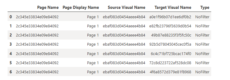
The main function used here is the Semantic Link Labs list_visual_interactions function, which gets the list of modified interactions.
var_rptw.list_visual_interactions()
If you just use that function, you will get a DataFrame with the following columns.
Pages have display names, but visuals don’t. The title we see on visuals in Power BI Desktop is just a property and is not returned by this function. So if you know your report well, you might be able to determine what things are by the GUID (or use Visual Studio Code to view the JSON and locate the visual, but we can make this better with a little more code.
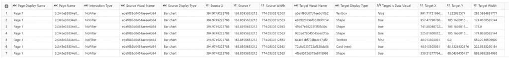
The list_visuals function provides more info about each visual, so if we merge (join) the dataframes containing the list of visuals and the list of modified interactions, we get something more useful.
I narrowed down the column list for the visuals to only the ones I felt were helpful. The list of interactions contains a source visual (the visual emitting the interaction) and a target visual (the visual receiving the interaction). I merge the visual interactions with the visuals twice, so we can get info on both the source and target visuals. After merging, I dropped some columns and renamed others, then reordered the remaining columns to make it easier to understand. And finally, I sorted the values by page, then visual, then interaction type.
This results in the following table.
Now I can see what page the visuals are on, which type of interaction they have, what type of visual is used for the source and target, and where the source and target are located on the page.
I can also check which visuals have no modified interactions.
df_nochangedinteractions = df_visuals[
    ~df_visuals['Visual Name'].isin(
        df_visualinteractions['Target Visual Name']
    )
]
print(
    'The following visuals are not the target of any modified '
    'interactions:'
)
display(df_nochangedinteractions)
Here, I take the full list of visuals and return any visual that is not listed in the target visuals in the table above. This returns the following table.
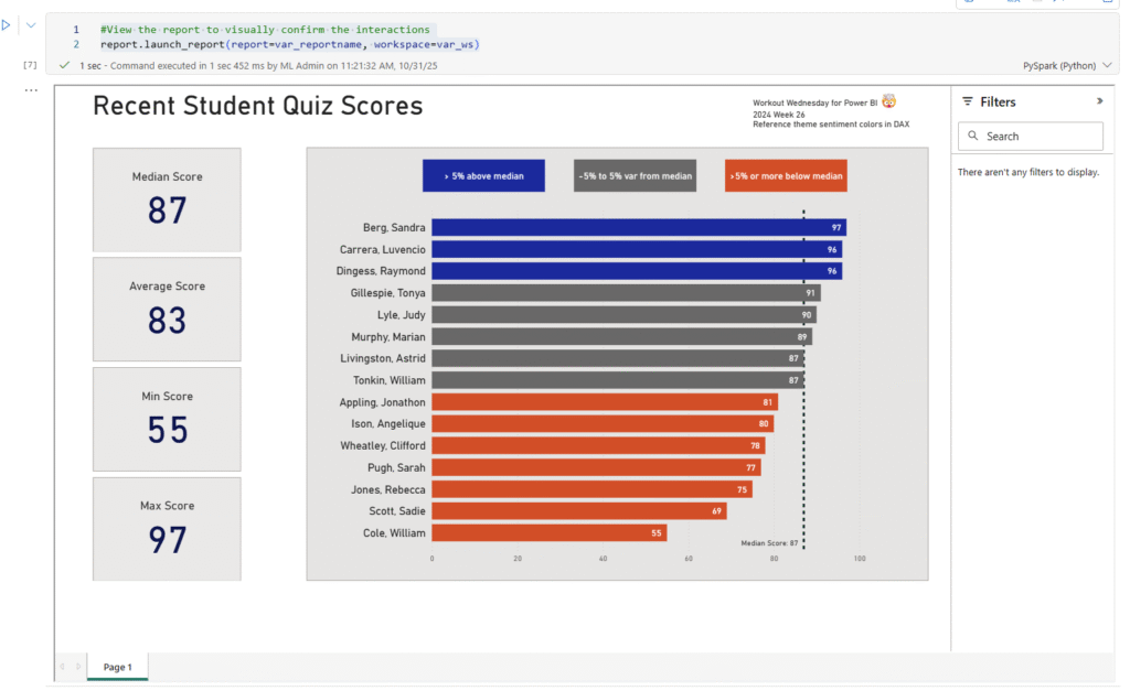
In my report, which uses the default size (1280 x 720), I have a large bar chart that is somewhat near the top of the page and about 1/3 of the way into the page. All the interactions of other visuals with this bar chart use the default interaction settings.
And if I run this last line of code, I can validate that by interacting with the report directly in my notebook.
#View the report to visually confirm the interactions
report.launch_report(report=var_reportname, workspace=var_ws)
This adds a report viewer window containing the fully interactive report in the cell results area. By interacting with the report, I can confirm that I have turned off all interactions from the bar chart to other visuals.
More posts about Semantic Link Labs
So far, I’ve been exploring the report and admin subpackages of Semantic Link Labs. Below are some other blog posts I’ve written about them.
https://procuresql.com/wp-content/uploads/2025/10/Screenshot-2026-02-12-124819.avif910986Meagan Longoria/wp-content/uploads/2024/05/Data-Architecture-as-a-Service-with-ProcureSQL.pngMeagan Longoria2025-10-31 18:23:542026-02-12 19:29:59Check Power BI report interactions with Semantic Link Labs
Setting page visibility and the active page are often overlooked last steps when publishing a Power BI report. It’s easy to forget the active page since it’s just set to whatever page was open when you last saved the report. But we don’t have to settle for manually checking these things before we deploy to a new workspace (e.g., from dev to prod). If our report is in PBIR format, we can run Fabric notebooks to do this for us. This is where Semantic Link Labs helps us.
You can download my notebook here. I’ll walk through the steps in this post.
Code Walkthrough
First, we must install semantic-link-labs. If you already have an environment with this library installed, you can use that and skip this step.
%pip install semantic-link-labs
Next, we need to import some modules.
# Imports
import sempy_labs as labs
from sempy_labs import report
import ipywidgets as widgets
from IPython.display import display
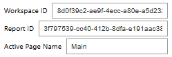
Then we can get to work. First, I’m capturing the following information using widgets: workspace ID, report ID, and page name.
First, I use the report ID entered into the widget to get the report name.
Then I create my report wrapper (var_rptw). This object will be used with all the subsequent functions.
Next I set the active page to the page name entered into the w_activepage widget using the set_active_page() function. Then I call hide_tooltip_drillthrough_pages().
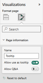
Each page has associated metadata that indicates whether it is a tooltip page and whether it is a drillthrough target page. I believe the tooltip page is determined by the page information setting labeled “Allow use as tooltip”.
The Allow use as tooltip setting is in the Page information section
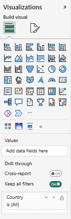
For drillthrough pages, I believe the presence of a field in the Drill through field well on the page is what causes it to be flagged as a drill through page.
The drill through fields are in the Visualizations pane when the page is selected.
Calling the set_active_page() and hide_tooltip_drillthrough_pages() functions changes the metadata for the report object, but we have to save the report changes back to the report in the target workspace, for the changes to take effect. This is why we call var_rptw.save_changes().
Once we save the changes, we get a response back that lists the changes made to the report.
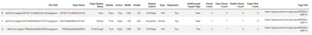
The output from calling save_changes() lists which page was set to active, which pages have been hidden, and a confirmation that the report definition was saved.
Calling list_pages() produces a pandas DataFrame with metadata for each page. We can refer to the Hidden, Active, Type, and Drillthough Target Page columns to confirm the desired changes.
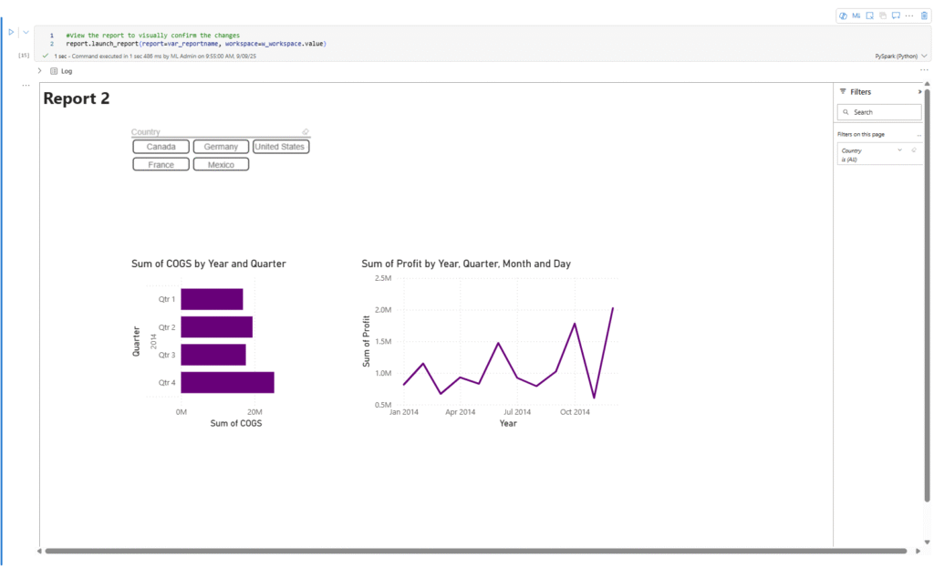
As a final confirmation, we can also view the Power BI report from within the notebook. That is what I’m doing with the launch_report() function. It provides a read-only view of the report in the notebook cell output..
More posts about Semantic Link Labs
So far, I’ve been exploring the report and admin subpackages of Semantic Link Labs. Below are some other blog posts I’ve written about them.
Want to learn more about Power BI Automation with Semantic Link Labs? Join our webinar this month covering this exact topic.
About ProcureSQL
ProcureSQL is the industry leader in providing data architecture as a service, enabling companies to harness their data and grow their business. ProcureSQL is 100% onshore in the United States and supports the four quadrants of data, including application modernization, database management, data analytics, and data visualization. ProcureSQL works as a guide, mentor, leader, and implementer to provide innovative solutions to drive better business outcomes for all businesses. Click here to learn more about our service offerings.
Do you have questions about leveraging AI, Microsoft Fabric, or the Microsoft Data Platform? You can chat with us for free one-on-one, or contact the team. We would love to share our knowledge and experience with you.
https://procuresql.com/wp-content/uploads/2025/09/MeaganLongoria.avif800800Meagan Longoria/wp-content/uploads/2024/05/Data-Architecture-as-a-Service-with-ProcureSQL.pngMeagan Longoria2025-09-09 17:38:482026-02-12 19:30:25Semantic Link Labs: A Key-player in Power BI Automation