Lots of people have created Power BI reports, using interactive data visualizations to explore and communicate data. When Power BI was first created, it was used in situations that weren’t ideal because that was all we had as far as cloud-based tools in the Microsoft data stack. Now, in addition to interactive reports, we have paginated reports and notebooks. In this post, I’ll discuss when notebooks might be an appropriate visualization tool.
High-level comparison
If you haven’t looked into Fabric notebooks for data visualization, the table below offers a high-level comparison to Power BI reports. There are edge cases where you could do something successfully in either tool, but generally certain personas and use cases lean towards one or the other.
Feature
Power BI
Fabric Notebooks
Purpose
Designed for interactive dashboards and reports
Used for data exploration, transformation, and advanced analytics
Visuals
Drag-and-drop visuals, prebuilt charts
Code-based visuals using Python (Matplotlib, Seaborn) or Spark libraries
Interactivity
Highly interactive, slicers, drill-throughs
Limited interactivity; static charts unless using specific libraries
Best For
Business reporting and storytelling
Data exploration, debugging, machine learning/AI
Where do notebooks shine?
Notebooks are not usually the best interface for business dashboards and scorecards, but there are other situations where they might be better than a Power BI report:
Data dumps (can save to OneLake or blob storage when output contains a lot of rows)
Detailed static chart images
Maps (interactive or static)
Highly customized charts and uncommon chart types
High-density visuals
Adding advanced statistics, AI, or ML on top of a base dataset before visualization
You can create a table (or tables) of data and output them to an easily accessible location, whether that is downloading the data directly from a notebook or exporting to OneLake. You don’t need to create a visual first, just to export the DataFrame contents.
There are lots of great mapping libraries available for Python, so if you can’t achieve what you need in an Azure Map visual and don’t want to pay for ArcGIS or another embedded service, you may consider creating your map in a notebook. Check out Plotly and DataShader for examples.
A map created using Altair in a Fabric notebook created by Kerry Kolosko
Many Power BI visuals have a default of 3,500 data points allowed. Some visuals, such as the Azure Map, allow up to 30,000 data points by default. If you have a situation where the data should not be aggregated or sampled, a python visual may be a good option.
A scatterplot created using Matplotlib in a Fabric notebook created by Kerry Kolosko
Sometimes we want to create highly customized visualizations that are just not achievable in the core or free custom Power BI visuals. While you can usually make what you need in Deneb, it may require a lot of effort or you may be introducing a skillset that your team doesn’t have or has chosen not to emphasize. If your team already knows Python, you can explore creating visuals in a notebook and outputting them as SVGs to include in documents, presentations, or websites.
A swarmplot created using Seaborn in a Fabric notebook created by Kerry Kolosko
And while it’s possible to add AI or ML to your data using Power Query, it is often easier to use Python libraries to add these capabilities and then visualize the data immediately after.
Interactivity
Python visuals can offer some interactivity, depending on the library. It is often only within one visual. For instance, you might have a drop-down for selecting a category which filters a bar chart. Or you might use a lasso tool to select an area of a map. What is less common is to create a set of multiple charts in a single output that all interact with each other. That is one area where Power BI shines and requires little to no effort, since the default is for visuals to interact with all other visuals on the report page.
Remember your audience
While the visualizations produced by a notebook may be great for your audience, the notebook interface itself might not be ideal for consumption. Data engineers are often used to notebooks in other contexts, but the average business analyst might not want to use a notebook. This may lead to creating the visualization in one tool and consuming it in another. You’ll have to examine the context to and use case to decide if that is appropriate.
Could a notebook really be easier than a drag-and-drop interface?
If writing Python code seems unattainable, a notebook might not be for you. But I’d like to share a couple of thoughts about what has made Python easier for me.
The libraries
After learning about the concept of a nullity matrix, I set out to create one in Power BI for a Workout Wednesday challenge. After experimenting with core visuals and not liking the results, I switched to Deneb. I struggled a bit to get what I needed in Deneb and after an hour or so, I sought out help. The Deneb visual ultimately worked fine, but it was a lot of effort to get there. There is a free library to do this in Python. Once you have a DataFrame with the data you want to include, it’s two lines of code to create the visual.
A nullity matrix created using the missingno library created by Meagan Longoria
AI Coding Assistants
With AI assistants to help us write Python code, the barrier to getting our desired visual output in a notebook is possibly lower than ever. You can integrate AI assistants like GitHub Copilot or Claude Code into VS Code to have a more seamless development experience outside of a browser, if you prefer. Just be sure that your use of AI coding assistants meets any organizational and/or personal requirements around information security and intellectual property.
More posts on data viz in notebooks
I’ve planned at least a couple more posts to help people get started using notebooks for data visualization. Stay tuned!
The post Data Viz in Fabric Notebooks first appeared on Data Savvy.
https://procuresql.com/wp-content/uploads/2025/11/pythonnullitymatrix.avif7461024Meagan Longoria/wp-content/uploads/2024/05/Data-Architecture-as-a-Service-with-ProcureSQL.pngMeagan Longoria2025-11-24 01:30:312026-02-12 19:27:02Data Viz in Fabric Notebooks
Have you ever added a visual to a Power BI report page and published the updated report only to realize you forgot to adjust a related bookmark? It’s very easy to do. The Power BI user interface doesn’t allow you to determine which visuals are included in a bookmark that includes only selected visuals. And it takes at least 4 clicks to open the Bookmarks and Selection tabs, and then select a bookmark to see which visuals are visible or hidden when the bookmark is selected.
If you’d rather not have to click around and guess, you can parse the JSON definition of your report, or use a Fabric notebook to get information about the bookmarks in a PBIR-format report that is published in the Power BI service. What I’ll demonstrate below is a great check to perform before publishing to a higher environment (e.g., test, stage, QA, prod, whatever you call your non-dev environments).
Code walkthrough
If you aren’t using an environment with Semantic Link Labs already installed, you must do that first as shown below.
%pip install semantic-link-labs
Here I import and alias the report module from Semantic Link Labs as well as pandas.
# Imports
import sempy_labs as labs
from sempy_labs import report

import pandas as pd
Next I need to create a report wrapper for the report in which I want to review the bookmarks.
The main function used here is the Semantic Link Labs list_bookmarks function, which returns a list of all bookmarks in the selected report.
The list_bookmarks function returns a DataFrame with the following columns.
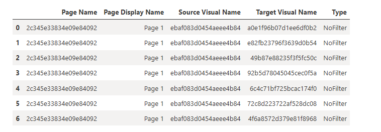
What we see in the results above is a report with 3 bookmarks. The Sales Only bookmark includes all 7 visuals on the Dashboard page. Two of the 7 visuals are hidden. The Details bookmark includes all visuals on the Drill Details page, both of which are visible. The US2014 bookmark includes 6 visuals on the Dashboard page.
The three bookmarks from the report being analyzed
Combining list_bookmarks and list_visuals
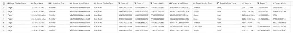
What we see in the results above is a good start, but we need to add more information about the visuals referenced by the bookmarks. We can use the list_visuals function to get more info on each visual and then merge (join) the bookmark and visual data together for a more complete picture.
First, I obtained the list of all visuals in the report. Then I narrowed down the column list so I only kept what was helpful for this use case. Then I got the list of bookmarks. I merged the visuals and bookmarks by performing and inner join on the Visual Name (which is really the unique GUID for the visual). After merging, I dropped the Page Name column that came from the bookmarks DataFrame and renamed the Page Name column that came from the visuals DataFrame. Then I reordered the columns to make it easier to use the final table. Finally, I sorted the values by bookmark, visual type, and then the x and y coordinates of the visual.
That gives me the following table.
This gives me a better picture of which visuals are included in each bookmark, as well as the type of visual, the location and size of the visual, and whether it is hidden in the bookmarked state.
What’s Missing?
While we can infer some of the configured properties of a bookmark based upon what is returned here, it would be nice to have it explicitly returned. When we look at the JSON that defines the bookmark, we can see:
the bookmark display name (the name we see in the bookmarks pane)
the bookmark name (the GUID for the bookmark)
the page name (the GUID for the page)
the GUIDs for the target visuals
whether data is included in the bookmark
if data is included, the filter expressions
if data is included, slicer type and state
if data is included, the sort order for a visual
if data is included, drill location
if data is included, the spotlight mode of a visual
What we cannot get from the Semantic Link Labs function is the visual-level info. We don’t know the filter expressions, slicer state, sort order, drill location, and spotlight mode. We also can’t tell whether the bookmark includes data or whether the bookmark includes all visuals or selected visuals. We can sort of infer whether all visuals are selected by comparing the visuals on the page to the visuals included in a bookmark, but it would be great to have an easier way. I have logged an enhancement request on Github to ask that this information be made available via Semantic Link Labs.
If you need to deep dive into your bookmarks to ensure every filter and sort order is correct, the current Semantic Link Labs solution is not for you. But if you just need to check that the bookmarks are there and which visuals are included and/or hidden, this works nicely.
https://procuresql.com/wp-content/uploads/2025/11/bookmarks.avif170184Meagan Longoria/wp-content/uploads/2024/05/Data-Architecture-as-a-Service-with-ProcureSQL.pngMeagan Longoria2025-11-05 11:45:002026-02-12 19:31:19Check Power BI Bookmarks with Semantic Link Labs
It can be tedious to check what visual interactions have been configured in a Power BI report. If you have a lot of bookmarks, this becomes even more important. If you do this manually, you have to turn on Edit Interactions and select each visual to see what interactions it is emitting to the other visuals on the page.
But there is a better way!
Listing visual interactions
You can use a a bit of Python in a Fabric notebook and the Semantic Link Labs library to return the list of modified interactions in a DataFrame. I take it one step further and also check for visuals that are not the target of any modified interactions.
For this to be useful, you have to understand that the default interactions are to cross-highlight or cross-filter where available. For instance, if you have a column chart that shows average student grades by subject and a bar chart that shows average grade by student, when you select the Science subject on the column chart, it will cross-highlight the bar chart so you can see how the student’s science grade compares to their total average. If you don’t like that interaction, you can change it. You can make it filter so you only see the science grade without the total in the background. Or you can configure it so there is no interaction and the bar chart is not cross-filtered or cross-highlighted.
The report definition is in JSON, and if you change no interactions from the default, interactions will not all be specifically listed. But if we change an interaction, we would see that change in the JSON.
Code walkthrough
If you aren’t using an environment with Semantic Link Labs already installed, you must do that first as shown below..
%pip install semantic-link-labs
Here I import and alias the report module from Semantic Link Labs as well as pandas.
# Imports
import sempy_labs as labs
from sempy_labs import report

import pandas as pd
Next I need to create a report wrapper for the report in which I want to review the interactions.
The main function used here is the Semantic Link Labs list_visual_interactions function, which gets the list of modified interactions.
var_rptw.list_visual_interactions()
If you just use that function, you will get a DataFrame with the following columns.
Pages have display names, but visuals don’t. The title we see on visuals in Power BI Desktop is just a property and is not returned by this function. So if you know your report well, you might be able to determine what things are by the GUID (or use Visual Studio Code to view the JSON and locate the visual, but we can make this better with a little more code.
The list_visuals function provides more info about each visual, so if we merge (join) the dataframes containing the list of visuals and the list of modified interactions, we get something more useful.
I narrowed down the column list for the visuals to only the ones I felt were helpful. The list of interactions contains a source visual (the visual emitting the interaction) and a target visual (the visual receiving the interaction). I merge the visual interactions with the visuals twice, so we can get info on both the source and target visuals. After merging, I dropped some columns and renamed others, then reordered the remaining columns to make it easier to understand. And finally, I sorted the values by page, then visual, then interaction type.
This results in the following table.
Now I can see what page the visuals are on, which type of interaction they have, what type of visual is used for the source and target, and where the source and target are located on the page.
I can also check which visuals have no modified interactions.
df_nochangedinteractions = df_visuals[
    ~df_visuals['Visual Name'].isin(
        df_visualinteractions['Target Visual Name']
    )
]
print(
    'The following visuals are not the target of any modified '
    'interactions:'
)
display(df_nochangedinteractions)
Here, I take the full list of visuals and return any visual that is not listed in the target visuals in the table above. This returns the following table.
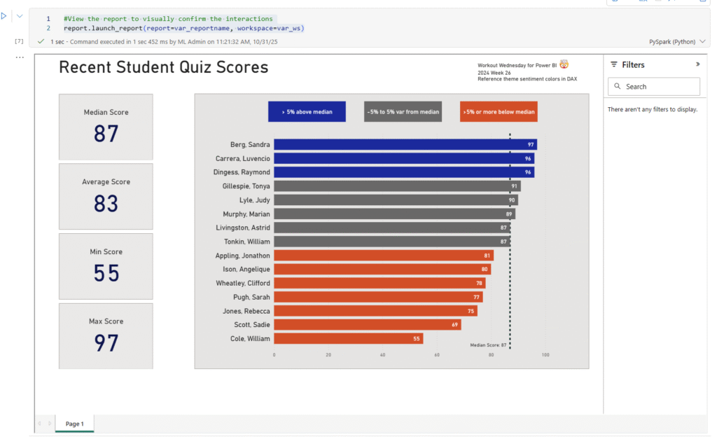
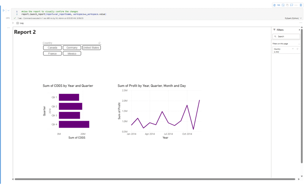
In my report, which uses the default size (1280 x 720), I have a large bar chart that is somewhat near the top of the page and about 1/3 of the way into the page. All the interactions of other visuals with this bar chart use the default interaction settings.
And if I run this last line of code, I can validate that by interacting with the report directly in my notebook.
#View the report to visually confirm the interactions
report.launch_report(report=var_reportname, workspace=var_ws)
This adds a report viewer window containing the fully interactive report in the cell results area. By interacting with the report, I can confirm that I have turned off all interactions from the bar chart to other visuals.
More posts about Semantic Link Labs
So far, I’ve been exploring the report and admin subpackages of Semantic Link Labs. Below are some other blog posts I’ve written about them.
https://procuresql.com/wp-content/uploads/2025/10/Screenshot-2026-02-12-124819.avif910986Meagan Longoria/wp-content/uploads/2024/05/Data-Architecture-as-a-Service-with-ProcureSQL.pngMeagan Longoria2025-10-31 18:23:542026-02-12 19:29:59Check Power BI report interactions with Semantic Link Labs
Setting page visibility and the active page are often overlooked last steps when publishing a Power BI report. It’s easy to forget the active page since it’s just set to whatever page was open when you last saved the report. But we don’t have to settle for manually checking these things before we deploy to a new workspace (e.g., from dev to prod). If our report is in PBIR format, we can run Fabric notebooks to do this for us. This is where Semantic Link Labs helps us.
You can download my notebook here. I’ll walk through the steps in this post.
Code Walkthrough
First, we must install semantic-link-labs. If you already have an environment with this library installed, you can use that and skip this step.
%pip install semantic-link-labs
Next, we need to import some modules.
# Imports
import sempy_labs as labs
from sempy_labs import report
import ipywidgets as widgets
from IPython.display import display
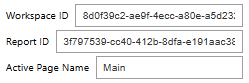
Then we can get to work. First, I’m capturing the following information using widgets: workspace ID, report ID, and page name.
First, I use the report ID entered into the widget to get the report name.
Then I create my report wrapper (var_rptw). This object will be used with all the subsequent functions.
Next I set the active page to the page name entered into the w_activepage widget using the set_active_page() function. Then I call hide_tooltip_drillthrough_pages().
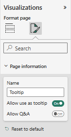
Each page has associated metadata that indicates whether it is a tooltip page and whether it is a drillthrough target page. I believe the tooltip page is determined by the page information setting labeled “Allow use as tooltip”.
The Allow use as tooltip setting is in the Page information section
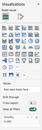
For drillthrough pages, I believe the presence of a field in the Drill through field well on the page is what causes it to be flagged as a drill through page.
The drill through fields are in the Visualizations pane when the page is selected.
Calling the set_active_page() and hide_tooltip_drillthrough_pages() functions changes the metadata for the report object, but we have to save the report changes back to the report in the target workspace, for the changes to take effect. This is why we call var_rptw.save_changes().
Once we save the changes, we get a response back that lists the changes made to the report.
The output from calling save_changes() lists which page was set to active, which pages have been hidden, and a confirmation that the report definition was saved.
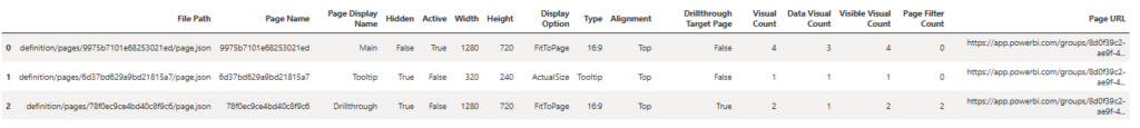
Calling list_pages() produces a pandas DataFrame with metadata for each page. We can refer to the Hidden, Active, Type, and Drillthough Target Page columns to confirm the desired changes.
As a final confirmation, we can also view the Power BI report from within the notebook. That is what I’m doing with the launch_report() function. It provides a read-only view of the report in the notebook cell output..
More posts about Semantic Link Labs
So far, I’ve been exploring the report and admin subpackages of Semantic Link Labs. Below are some other blog posts I’ve written about them.
Want to learn more about Power BI Automation with Semantic Link Labs? Join our webinar this month covering this exact topic.
About ProcureSQL
ProcureSQL is the industry leader in providing data architecture as a service, enabling companies to harness their data and grow their business. ProcureSQL is 100% onshore in the United States and supports the four quadrants of data, including application modernization, database management, data analytics, and data visualization. ProcureSQL works as a guide, mentor, leader, and implementer to provide innovative solutions to drive better business outcomes for all businesses. Click here to learn more about our service offerings.
Do you have questions about leveraging AI, Microsoft Fabric, or the Microsoft Data Platform? You can chat with us for free one-on-one, or contact the team. We would love to share our knowledge and experience with you.
https://procuresql.com/wp-content/uploads/2025/09/MeaganLongoria.avif800800Meagan Longoria/wp-content/uploads/2024/05/Data-Architecture-as-a-Service-with-ProcureSQL.pngMeagan Longoria2025-09-09 17:38:482026-02-12 19:30:25Semantic Link Labs: A Key-player in Power BI Automation
Earlier this month, we hosted T-SQL Tuesday and chose the topic of Growing the Younger Data Community and Speakers. Today, I bring you a summary recap of everyone who shared their thoughts on this subject with links to their full content.
Rob Farley shares his thoughts on mentoring various people, and some of that involves presenting. Still, more of it is about establishing them as experts, helping them learn what they want to know, and encouraging them to take steps to achieve their goals. If someone feels comfortable in their own skin as an expert, knowing that they are genuinely good at what they do, then they will often start to realize that they belong on the other side of the room.
Andy Yun flips the script and asks the readers to get involved. You do not have to be an expert to help. You can help by encouraging someone to share their ideas and become more involved in the data community.
https://procuresql.com/wp-content/uploads/2025/07/tsqltuesday.webp150150John Sterrett/wp-content/uploads/2024/05/Data-Architecture-as-a-Service-with-ProcureSQL.pngJohn Sterrett2025-07-16 08:16:432025-09-06 19:49:28TSQLTuesday #188 – The Recap of Growing the Younger Data Community and Speakers
TSQLTuesday #188 – Growing the Younger SQL Community and Speakers
This month, I am hosting T-SQL Tuesday for the very first time. T-SQL Tuesday is a monthly blog party created by Adam Machanic in 2009. I want to give Steve Jones a shout-out for allowing me to host this month’s edition.
Each month, a new topic is chosen and published on the first Tuesday of the month, and contributors post their takes on the following Tuesday. Anyone can participate by sharing their thoughts on their preferred forum. Please publish your post by July 8th at midnight CDT. Please leave a comment on this blog post with the link to your response so that we can include your thoughts in the roundup. Doing so will provide everyone with a centralized location to find all the responses and let me know which ones to include in the recap.
Growing the Younger Data Community and Speakers
ProcureSQL wouldn’t exist today if it weren’t for being involved in the community. Straight out of college, Dolph Santorine dragged me along to the local AITP monthly meetings in Wheeling, WV. This led me to start a SQL Server user group in Wheeling and host SQL Saturday events in both Wheeling and Austin. During SQL Saturday Austin in May, I had a great conversation with Steve about our thoughts on the state of the SQL community post-COVID. We both noticed that the average speaker age wasn’t getting any younger. This leads me to ask this month’s question.
What are you doing, or what can we do to encourage younger people to get involved in the SQL community while increasing the number of younger speakers?
Anything is fair game. For example, here were some things I was thinking:
Involving the local colleges in event planning for SQL Saturdays
Bringing interns and younger co-workers to user group meetings
Hosting lightning talks, where speakers focus on a single topic for five to ten minutes.
Mentoring a speaker through building and delivering their first presentation
Allowing a new speaker to co-present with you
Doing a one-on-one review, giving a critique on how they can improve their session
Create a budget for your young speakers to speak at events.
Hosting a track or event, only allowing new speakers the opportunity to present and share their knowledge
Making sure new local speakers can speak at your event, if that means saying no to MVPs and Microsoft Employees.
You Never Will Know the Impact You Will Generate
As the host this month, I will go first. I want to share two brief stories about helping new speakers and the impact it had on them.
My first big presentation was at SQL Saturday DC, many years ago. If you are familiar with Amateur Night at the Apollo, I would have given myself the hook.
It might have been my last presentation if it weren’t for Allen White taking the time to sit with me one-on-one after my session and go through the things I did well and the areas where I could improve, ensuring my presentation was better the next time I gave it. ProcureSQL would most likely never have existed without Allen taking the time to help make me a better speaker. It’s fantastic to look back at how fifteen minutes had such a significant impact on my career. I would have never spoken at PASS Summit or become a Data Platform MVP. I definitely wouldn’t have been focused on helping new speakers as well.
Later on, I worked at RDX for Kon Melamud. One of the most intelligent people I’ve ever met. He had never given a community session before, even though he worked down the street from the Pittsburgh SQL User Group meeting location. One month, I was the speaker, and I talked him into going with me and standing next to me as I gave the presentation. I told him I would do the presentation. When I am done with a section, I will ask him to share his thoughts and experience working with over 100 different customers. He was extremely nervous, and this was the perfect way to introduce him to the community. Doing so got him started and, over time, encouraged him to establish a budget and allow others at RDX to speak at community events. Today, Kon is the CTO at ProcureSQL, but more importantly, my best friend. Our relationship wouldn’t have grown without our involvement in the community together.
Instructions
Now that you have the topic, let’s recap the instructions:
Schedule your post to publish on Tuesday, July 8th.
Please include the T-SQL Tuesday image.
Please post a link to your blog post in the comments of this post, so I have an easy way to find it and include it in the recap.
Post it to social media if you can, and include the #tsqltuesday hashtag.
https://procuresql.com/wp-content/uploads/2025/07/tsqltuesday.webp150150John Sterrett/wp-content/uploads/2024/05/Data-Architecture-as-a-Service-with-ProcureSQL.pngJohn Sterrett2025-07-01 17:17:532025-09-06 19:56:15TSQLTuesday #188 – Growing the Younger Data Community and Speakers
Microsoft Fabric Mirroring changes the game with Data Ingestion, giving you near real-time data with a no-code framework.
Microsoft’s Fabric Mirroring will change how you perform data ingestion. If you are using products to automate batch processes for data dumping, did you know that Fabric Mirroring might remove the need for these tools and provide you with near real-time access to the data as it changes in the source systems?
Suppose you have not yet heard of the medallion architecture. In that case, it involves utilizing bronze, silver, and gold layers to describe the data processing processes from intake into your data hub to consumption from your reporting applications of choice. This multi-layered approach existed before I started my analytics career in the early 2000s. Think of it simply as bronze being your unprocessed data, silver being somewhat cleaned and organized data processed from your bronze layer, and gold being your aggregated and optimized data ready for prime-time business insights.
It’s essential to understand the evolution of data management. From the ’90s to the early 2000s, the process of getting data from each application (referred to as a spoke) into your data repository (data hub) was complex. In the Microsoft world, multiple SSIS packages or other processes were used to pull data into tables with varchar(max); this was typically a batch process that ran on a schedule, leading to potential issues. There were so many SSIS packages that we needed an automation language to build them all, rather than doing them individually.
Many businesses’ analytics projects struggle to quickly integrate the correct data into their hub so that data transformations and validations can be effective. If you get this wrong, there is no point in collecting $200 and passing Go. Your data analytics project might end up going straight to jail.
How can we load data quickly and successfully?
I am introducing you to a no-code, near-real-time option for loading your data into your data lake (data hub) within Fabric. This new feature is known as Fabric Mirroring.
While I love the functionality of Fabric Mirroring, I am not a fan of the name. Many people with SQL Server experience think this is similar to Database Mirroring because these names are similar.
In my opinion, Fabric mirroring is similar to implementing Change Data Capture (CDC) on your SQL Server databases. CDC feeds data into a real-time streaming tool like Apache Kafka to copy data from your spoke (SQL Server application database) into your hub (Data Lake).
The benefit here is twofold. First, you don’t have to manage the Change Data Capture or Kafka implementations. Second, and most importantly, this is more than just an SQL Server solution. In the future, you can use Fabric Mirroring to ingest data from all your sources (spokes) into your data hub in near real-time, with minimal to no code required.
For example, here is how to use Fabric Mirroring to import Dynamics 365 or Power Apps data into Fabric. You can do the same for Azure Cosmos Database and Snowflake. SQL Server is coming soon.
Now I know I can use Fabric Mirroring to help me get near real-time data into my hub with no code required. Why else should Fabric Mirroring be a game-changer for my analytics projects?
The Fabric Mirror enables us to accomplish a lot more in less time.
Suppose you have an SLA for getting data into a data warehouse in 24 hours. Processing through all the layers took you 20 hours (12 hours into bronze, 6 hours from bronze to silver, and 6 hours from silver to gold). If you now had near real-time, say 90 seconds, to get changes into bronze, that gives you an extra 11 hours and 59 minutes to improve data quality, data validation, and other processes upstream.
Centralized Data Management
Having a single hub that the applications (spokes) automatically send data to, a centralized database, and the clients and tools used, eliminates the need to install additional software. You now transition from pulling data from the spokes with batch processing to pushing data from the spokes in near real-time. It also simplifies data governance and enhances security because combining this with Preview lets you see which spokes the data goes into.
For example, you must comply with GDPR, and Sarah in the UK has now requested that her data be removed. You can now easily find the data in the spokes from the hub to determine what data needs to be purged quickly.
Simplified Data Ingestion.
Instead of mixing and matching different data sources, your delta tables will be created across your Cosmos Databases, Azure SQL databases, Dynamics 365, and other future fabric mirroring sources. You no longer need to worry about which sources are in Excel, CSV, flat file, JSON, etc. They are all in the same format, ready for you to do your transformations, data validation, and apply any business rules required for your silver level.
Improved Query Performance
Those who know me know that I love discussing query performance tuning. I am passionate about making databases go just as fast as your favorite F1 race car. I also know that you have at least one group of people running reporting queries against your line-of-business application database or an availability group replica. This leads to increased locks that slow down the original purpose of your application databases. These locks are now removed, and these reports can be sent against your data hub.
The mirrored data is also stored in an analytics-ready format, such as delta tables, which enhances query performance across various tools within Microsoft Fabric, including Power BI.
What if you cannot use Fabric Mirroring?
The sources for Microsoft Fabric to date are limited. If I had on-premise data sources or other sources that are not ready for Fabric Mirroring, I would still encourage this architecture approach of using change data capture, where available, to lead to streaming your data into your data hub of choice.
About ProcureSQL
ProcureSQL is the industry leader in providing data architecture as a service, enabling companies to harness their data and grow their business. ProcureSQL is 100% onshore in the United States and supports the four quadrants of data, including application modernization, database management, data analytics, and data visualization. ProcureSQL serves as a guide, mentor, leader, and implementer, providing innovative solutions to drive better business outcomes for all businesses. Click here to learn more about our service offerings.
https://procuresql.com/wp-content/uploads/2025/06/Microsoft-Fabric-Miroring-Changing-Data-Ingestion.webp6301120John Sterrett/wp-content/uploads/2024/05/Data-Architecture-as-a-Service-with-ProcureSQL.pngJohn Sterrett2025-06-18 23:15:362025-09-06 20:08:19Fabric Mirroring is Changing the Game for Data Ingestion
In 2023, Microsoft announced its new platform, Microsoft Fabric, an innovative product that combined Microsoft Power BI, Azure Synapse Analytics, Azure Data Factory, Fabric SQL Databases, and Real-Time Intelligence into one platform.
Over 21,000 companies use Microsoft Fabric, and the success stories paint a promising future.
If your team hasn’t switched to Fabric yet, now is a great time to do so, as the transition has huge potential upside.
John Sterrett, ProcureSQL CEO, is attending the 2025 Microsoft Fabric Conference Partner Only Event.
The first significant benefit of the transition is a simplified work environment for all involved. Everything is integrated into one platform, eliminating headaches associated with handoffs and siloed workflow.
Data warehousing, data engineering, AI-powered analytics, data science, and business intelligence are now housed in one platform. A simpler platform means faster results for your company’s needs.
Moreover, as different teams collaborate, Fabric provides compliance features such as data tracking, version control, and role-based access, enabling multiple teams to work together simultaneously without compromising the integrity of your company’s data.
There is now an incredible amount of potential at their fingertips.
With Microsoft Fabric, forecasting future performance and AI-driven analysis now gives your teams a competitive edge.
This enables your business to transition from a purely reactive model to a proactive one, where you can stay one step ahead of what’s to come.
In terms of cost, you’ll be pleased to know that, despite all these new additions, the pricing model for Fabric remains scalable and flexible, depending on how you utilize it.
Microsoft provides a Fabric Capacity Estimator, allowing you to take full advantage of the new platform by understanding the up-front cost.
If you have already been using products from Azure and Microsoft, switching to Fabric is a no-brainer.
Transitioning to Microsoft Fabric
One of Fabric’s most valuable and convenient aspects is that its data and analytics can be shared across all teams for all to examine, including with your business’s non-tech parts, which are the decision-makers and subject matter experts. The data is easily interpreted, so minimal training is needed even if your users are not tech-savvy.
On top of that, with the involvement of AI, the data allows you to see patterns ahead of time so that everyone is on board if any anomalies or spikes in activity come up.
Transitioning to a new platform can be incredibly challenging, but here at Procure SQL, we’re here to help.
We’re ready to help your organization make this transition smoothly and with immediate impact.
Whether you’re still using Microsoft Power BI or a mix of analytics tools, our team can guide you through a phased implementation that minimizes disruption and maximizes value from the start.
Don’t wait to catch up; let ProcureSQL help you lead the way. Contact us today to get started on your Microsoft Fabric journey.
https://procuresql.com/wp-content/uploads/2025/04/ProcureSQL-at-Fabcon-2025.webp1024768Justin Cunningham/wp-content/uploads/2024/05/Data-Architecture-as-a-Service-with-ProcureSQL.pngJustin Cunningham2025-06-02 22:12:062025-09-06 20:15:42Microsoft Power BI to Microsoft Fabric: Are You Ready for the Transition?
With the release candidate of SQL Server 2025, which came out last week, I want to discuss a valuable feature you won’t see in the Microsoft press release: SQL Server 2025 Developer Standard Edition.
Microsoft is finally addressing a long-standing headache for database professionals. They finally included a Developer Standard edition in SQL Server 2025, fixing the mismatch between development and production environments. The new Standard Developeredition allows teams to build, test, and validate their database solutions using a free, fully licensed copy of the Standard edition for the first time!
SQL Server 2025 Developer Standard Edition eliminates costly licensing for non-production use while ensuring feature parity with production.
Previously, organizations used the Developer edition, functionally equivalent to the Enterprise edition, for development and testing. If you also used the enterprise edition in production, this wasn’t a problem. Problems occur when you try to save money using developer edition (enterprise edition) features in dev or test, while using the standard edition in production. This mismatch often led to surprises during deployment, such as features that worked in development but failed in production due to missing or restricted capabilities in the Standard edition. Or worse, code that works and returns the same results, but has abnormal performance because enterprise edition features cause a change in the execution plans.
For example, Intelligent Query Processing batch mode for row store—a feature only available in Enterprise and Developer editions—could not be used in Standard edition environments, leading to cases where performance can be good in development and testing with the same data and transactional load footprint as production, but give you worse performance in production when utilizing standard edition.
In the past, we would have to use the Developer edition, which opened this window for utilizing enterprise features in dev and test. With SQL Server 2025, you can select the Standard Developer edition or Enterprise Developer edition during the installation, ensuring your development environment mirrors production as closely as possible. This is especially valuable for teams whose production workloads run on the Standard edition.
With SQL Server performance, edition matters. Below is a chart showing that the majority of the performance-based features are Enterprise edition-only features. For two reasons, this article will focus on Online index rebuilds and batch mode for row store queries.
Error Example: Online Index Rebuilds
To illustrate the practical impact, consider the scenario where a developer tries to use the ALTER INDEX ... REBUILD WITH (ONLINE = ON) command. This command works flawlessly in a Developer (Enterprise) environment, allowing users to rebuild indexes without downtime. However, if the production environment is Standard, the same command will fail with an error, since online index rebuilds are not supported in the Standard edition.
While this is not too hard to catch in testing, you would be surprised how often it is missed.
Let’s look at one more example that doesn’t cause an error but changes the performance and execution plans between the standard and enterprise editions. Because the developer edition before SQL Server 2025 used enterprise features, you would benefit from batch mode for your row store queries without knowing it.
SQL 2025 Standard Developer Edition: Different Plan and Performance
We will look at an example with the SQL Server Standard Developer Edition and the SQL Server Enterprise Developer Edition.
USE WideWorldImporters;
GO

SELECT
    ol.OrderID,
    ol.StockItemID,
    ol.Description,
    ol.OrderLineID,
    o.Comments,
    o.CustomerID
FROM
    Sales.OrderLines ol
INNER JOIN
    Sales.Orders o ON ol.OrderID = o.OrderID
WHERE
    ol.StockItemID = 168
GO
With the SQL Server Enterprise Developer Edition, we use an Adaptive Join to counteract filters with low and high numbers of rows.
With the SQL Server Standard Developer edition feature in SQL Server 2025, we see the same execution plan in dev, test, and production when we use the Standard edition for production. In this case, we don’t have batch mode, and you will see we use a hash join, which is not ideal for a small number of records for our filter.
The takeaway is that features can change functionality and how you get your data. This example would be more complex to catch in your development pipeline, most likely leading to a bad taste in your mouth about development and test being fast, but seeing negative performance when you release changes to production.
In summary, SQL Server 2025’s Standard Developer edition is a vital tool for any organization that values consistency and reliability across its database environments. Using the much more affordable standard edition of SQL Server empowers developers to test confidently, knowing that what works in development will also work in production—no more unpleasant feature surprises at go-live.
/wp-content/uploads/2024/05/Data-Architecture-as-a-Service-with-ProcureSQL.png00John Sterrett/wp-content/uploads/2024/05/Data-Architecture-as-a-Service-with-ProcureSQL.pngJohn Sterrett2025-05-26 04:18:242026-02-15 22:41:56SQL Server 2025 Standard Developer Edition
With the release candidate of SQL Server 2025, which came out last week, I want to discuss a valuable feature you will not see in the Microsoft press release: SQL Server 2025 Developer Standard Edition.
Microsoft is finally addressing a long-standing headache for database professionals. They finally included a Developer Standard edition in SQL Server 2025, fixing the mismatch between development and production environments. The new Standard Developeredition allows teams to build, test, and validate their database solutions using a free, fully licensed copy of the Standard edition for the first time!
SQL Server 2025 Developer Standard Edition eliminates costly licensing for non-production use while ensuring feature parity with production.
Previously, organizations used the Developer edition, functionally equivalent to the Enterprise edition, for development and testing. If you also used the enterprise edition in production, this wasn’t a problem. Problems occur when you attempt to save money by using developer edition (enterprise edition) features in development or testing, while using the standard edition in production. This mismatch often led to surprises during deployment, such as features that worked in development but failed in production due to missing or restricted capabilities in the Standard edition. Or worse, code that works and returns the same results, but has abnormal performance because enterprise edition features cause a change in the execution plans.
For example, Intelligent Query Processing batch mode for row store is a feature only available in Enterprise and Developer editions. This feature cannot be used in Standard Edition environments, leading to cases where performance is good in development and testing with the same data and transactional load footprint as production, but yields worse performance in production when utilizing Standard Edition.
In the past, we would have had to use the Developer edition, which opened this window for utilizing enterprise features in dev and test. With SQL Server 2025, you can select the Standard Developer edition or Enterprise Developer edition during the installation, ensuring your development environment mirrors production as closely as possible. This is especially valuable for teams whose production workloads run on the Standard edition.
With SQL Server 2025 you can pick enterprise or developer for your free development edition.
With SQL Server performance, edition matters. Below is a chart showing that the majority of the performance-based features are Enterprise edition-only features. For two reasons, this article will focus on Online index rebuilds and batch mode for row store queries.
A breakdown of SQL Server 2025 performance features by edition lets you see which features are enterprise-only. If you couldn’t tell, it’s most of them. 🙂
Error Example: Online Index Rebuilds
To illustrate the practical impact, consider the scenario where a developer attempts to use the ALTER INDEX ... REBUILD WITH (ONLINE = ON)command. This command works flawlessly in a Developer (Enterprise) environment, allowing users to rebuild indexes without downtime. However, if the production environment is Standard, the same command will fail with an error, since online index rebuilds are not supported in the Standard edition.
Online index rebuild online fails on standard developer edition but will succeed with the enterprise developer edition.
While this is not too difficult to catch in testing, you may be surprised at how often it is missed.
Let’s look at one more example that doesn’t cause an error but changes the performance and execution plans between the standard and enterprise editions. Because the developer edition before SQL Server 2025 used enterprise features, you would benefit from batch mode for your row store queries without knowing it.
SQL 2025 Standard Developer Edition: Different Plan and Performance
We will examine an example using the SQL Server Standard Developer Edition and the SQL Server Enterprise Developer Edition.
USE WideWorldImporters;
GO

SELECT
    ol.OrderID,
    ol.StockItemID,
    ol.Description,
    ol.OrderLineID,
    o.Comments,
    o.CustomerID
FROM
    Sales.OrderLines ol
INNER JOIN
    Sales.Orders o ON ol.OrderID = o.OrderID
WHERE
    ol.StockItemID = 168
GO
With the SQL Server Enterprise Developer Edition, we use an Adaptive Join to counteract filters with low and high numbers of rows.
The enterprise developer edition includes the adaptive join, an enterprise edition feature that allows you to use batch mode for row mode queries.
With the SQL Server Standard Developer edition feature in SQL Server 2025, we observe the same execution plan in development, testing, and production when using the Standard edition for production. In this case, we don’t have batch mode, and you will see we use a hash join, which is not ideal for a small number of records for our filter.
The takeaway is that features can change functionality and how you get your data. This example would be more complex to catch in your development pipeline, most likely leading to a bad taste in your mouth about development and testing being fast, but seeing negative performance when you release changes to production.
SQL Server 2025’s Standard Developer edition is a vital tool for any organization that values consistency and reliability across its database environments. Using the much more affordable standard edition of SQL Server empowers developers to test confidently, knowing that what works in development will also work in production. No more unpleasant feature surprises at go-live.
If you like our blog posts, subscribe to our newsletter. We will share all kinds of great stuff for FREE! If you’d like to chat about this feature or anything else database-related, contact us!
https://procuresql.com/wp-content/uploads/2018/09/Procure-SQL-September-2018-Training-Opportunities.jpg5401018John Sterrett/wp-content/uploads/2024/05/Data-Architecture-as-a-Service-with-ProcureSQL.pngJohn Sterrett2025-05-26 04:18:242025-09-06 20:26:54Standard Developer Edition is added to SQL Server 2025